Why Interface Designers Hate This Column
Not too long back, this column demonstrated how PHP's image-generation capabilities on the server side could be used to create simple GIF or JPEG images that responded dynamically to text input. This week, I'm going to help you take a few more graphic artists off your payroll by demonstrating some powerful tricks on the client side of things, with some of the powerful special effects that ship as a part of Microsoft Internet Explorer 4.x and above.
Yup, you read that right - the image filters and transitions you'll be learning about over the next few pages will not work, no how now way, in Netscape Navigator 4.x. You have been warned!
Filtering Out The Good Stuff
The special effects available in Internet Explorer broadly fall into one of two categories.
"Filters" are basic image manipulation tools, similar to those found in image editing packages like Adobe Photoshop or CorelDRAW! They allow you to apply basic transformations to an image - alter the level of transparency, rotate or flip the image, alter colour information and the like.
"Transitions" are special effects which are activated as a user exits or enters a specific Web page, and can best be compared to the various transition effects familiar to users of presentation packages like Microsoft Powerpoint. Transition effects include image morphing, vertical or horizontal blinds, wipes and fades.
Filters can typically be applied to specific HTML constructs only - the most common is the IMG construct, although you can also use them with the BODY, DIV, SPAN, and TABLE constructs. In order to provide Web developers with a fair amount of flexibility, filters can be activated either via simple CSS declarations or through Javascript code.
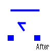
Before I get into the meat of each filter, here's a simple example which demonstrates the "flipV" filter as applied to an image. Note the new CSS keyword "filter", used to specify the type of filter to be used.
<html>
<head>
</head>

<body>

<img src="face.gif" border="0" style="filter: flipV">

</body>
</html>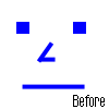
You could also flip text, as the following example demonstrates:
<html>
<head>
<style type="text/css">
div.flipped {position: absolute; top: 0; left: 50; font-family: Arial; filter: flipV}
</style>
</head>

<body>

<div class="flipped">
Upside-down and lovin' every minute!
</div>

</body>
</html>
I'll also demonstrate how Javascript can be used to apply a filter to a specific object - but that's a little further down.
A Little Transparency
Let's now get into the guts of the various filters available to the Web developer. You've already seen the "flipV" filter, used to flip an object vertically - and Internet Explorer also comes with a corresponding "flipH" filter, used to flip objects horizontally. Take a look.
<html>
<head>
<style type="text/css">
div.flipped {position: absolute; top: 0; left: 0; font-family: Arial; font-weight: bolder; filter: flipH}
</style>
</head>

<body>

<div class="flipped">
I'm flippin' out here!
</div>

</body>
</html>
The very powerful "alpha" filter allows you to control the alpha, or transparency, levels of the image. By specifying the level of opacity on a scale on a 0 to 100 scale, you can alter the appearance of an image substantially.
<html>
<head>
</head>

<body>

<img src="face.gif" border="0" style="filter: alpha(opacity=50)">

</body>
</html>
Or you could also make the image vanish completely - although why you would want to do this is beyond me!
<html>
<head>
</head>

<body>

<img src="square.gif" border="0" style="filter: alpha(opacity=0)">

</body>
</html>
Now you see it, now you don't!
Shadow Boxing
Next, how about adding a shadow to the object? There's a "shadow" filter designed especially to add a gradient to the edges of the object in order to simulate a shadow around it:
<html>
<head>
</head>

<body>

<div style="position: absolute; top:50; left:50; font-family: Arial; font-size: 20pt; filter: shadow">
Shadow-boxing in the sunshine
</div>

</body>
</html>
If you try that out, you'll see that it isn't very readable. How about if I change the colour of the shadow to gray?
<div style="position: absolute; top:50; left:50; font-family: Arial; font-size: 20pt; filter:
shadow(color=gray)">
Shadow-boxing in the sunshine
</div>
Much better! As you can see, the "shadow" filter allows you to change the colour of the shadow via the "color" attribute. You can also change the direction in which the shadow is cast with the "direction" attribute - try each of these versions to see how this works:
<div style="position: absolute; top:50; left:50; font-family: Arial; font-size: 20pt; filter: shadow(color=gray, direction=90)">
Shadow-boxing in the sunshine
</div>

<div style="position: absolute; top:50; left:50; font-family: Arial; font-size: 20pt; filter: shadow(color=gray, direction=180)">
Shadow-boxing in the sunshine
</div>

<div style="position: absolute; top:50; left:50; font-family: Arial; font-size: 20pt; filter: shadow(color=gray, direction=270)">
Shadow-boxing in the sunshine
</div>
In case you'd prefer a drop shadow, you can do that as well with the "dropShadow" filter, which also allows you to control the offset at which the shadow is generated.
<html>
<head>
</head>

<body>

<div style="position: absolute; top:50; left:50; font-family: Arial; font-size: 40pt; filter:
dropShadow(color=gray, offX=5, offY=5)">
Dropped Shadow
</div>

</body>
</html>
The "blur" filter allows you to blur the shape of your object - you can specify both the direction and amount of blurring. This example will demonstrate it:
<html>
<head>
</head>

<body>

<img style="filter: blur(strength=0, direction=90)" src="face.gif" border="0">
<br>
<img style="filter: blur(strength=3, direction=90)" src="face.gif" border="0">
<br>
<img style="filter: blur(strength=6, direction=90)" src="face.gif" border="0">
<br>
<img style="filter: blur(strength=9, direction=90)" src="face.gif" border="0">
<br>
<img style="filter: blur(strength=12, direction=90)" src="face.gif" border="0">
<br>
<img style="filter: blur(strength=15, direction=90)" src="face.gif"  border="0">

</body>
</html>
You could also try the new "motion blur" filter, which allows you to blur an object such that it appears to be in motion.
<html>
<head>
</head>

<body>

<img style="filter: progid:DXImageTransform.Microsoft.MotionBlur(strength=20, direction=90)"
src="face.gif" border="0">

</body>
</html>
The somewhat convoluted syntax is the new method of accessing filters under Internet Explorer 5.5. As a matter of fact, much of the filter syntax in this article comes from the days of Internet Explorer 4.x, and has now been replaced with the convoluted mess above. Luckily, newer versions of the browser continue to support the old way of doing things - else this article would look far more intimidating than it currently does!
Putting On Your Mask
The "mask" filter does exactly what its name suggests - it turns all the transparent pixels within an object into a specific colour and simultaneously takes all the non-transparent pixels in the specified object and turns them transparent. Note, however, that for this filter to work, the specified object must have some transparent pixels - like a transparent GIF or a block of text.
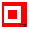
The following example turns the transparent areas of the image "square.gif" red.
<html>
<head>
</head>

<body>

<img style="filter: mask(color=red)" src="square.gif" border="0">

</body>
</html>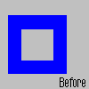
Alternatively, if you'd like your image to appear in grayscale, you could simply use the "gray" filter to remove all colour information from the image.
<img style="filter: gray" src="square.gif" border="0">You could even reverse the colours of the image with the "invert" filter - be warned that most images typically look much uglier after this!
<img style="filter: invert" src="square2.gif" border="0">
And the "chroma" filter comes in handy when you need to make specific colours within an object transparent. Images which are highly compressed or dithered, like JPEG images, typically show poor results with this filter. The code
<img src="square.gif" border="0" style="filter: chroma(color=red)">would turn all instances of the colour red within the image transparent.

If you're looking for something a little more unusual, there's the "wave" filter, which performs a wave distortion across the object it's applied to. This works best with images, rather than text - take a look:
<html>
<head>
</head>

<body>

<img style="filter: wave(strength=9, freq=10)" src="face.gif" border="0">

</body>
</html>
The "strength" attribute of the filter controls the level of intensity of the distortion, while the "freq" attribute controls the number of "waves" that appear in the distorted image.
The "glow" filter allows you to make your object glow - take a look:
<img src="face.gif" border="0" style="filter: glow(color=red)">There's also a new "emboss" filter, which allows you to display an object as a gray embossed texture. Take a look:
<html>
<head>
</head>

<body>

<div style="position: absolute; top:50; left:50; font-family: Arial; font-size: 40pt; filter: progid:DXImageTransform.Microsoft.Emboss">
Who's The Em-boss?
</div>

</body>
</html>
Scripting Your Filters
It's also possible to access all these filters via JavaScript through the special Javascript array called "filters". For example, if you had the following piece of HTML,
<img id="face" style="filter: wave(strength=0, freq=1)" src="face.gif" border="0">you could access the "wave" filter attached to the image in any of the following ways:
document.all.face.filters[0]
document.all.face.filters["wave"]
document.all.face.filters.wave
document.all.face.filters.item(0)
document.all.face.filters.item("wave")
It's also possible to retrieve and manipulate filter attributes through Javascript, as the following example will demonstrate:
<html>
<head>
<basefont face=Arial>
<script language="Javascript">

var dir;

function wave(dir)
{
if (dir == "+")
    {
    document.all.face.filter.item(0).strength += 10;
    }
else if (dir == "-")
    {
    document.all.face.filters["wave"].strength -= 10;
    }

}

</script>
</head>

<body>

<img id="face" style="filter: wave(strength=0, freq=1)" src="face.gif" border="0">
<br>
<a href="javascript: wave('+');">Increase wave strength</a>
<br>
<a href="javascript: wave('-');">Decrease wave strength</a>
</body>
</html>
Into The Blender
In addition to all these filters, Internet Explorer also comes with in-built capabilities for transition effects as you move from page to page within a site. These transitions are nothing but very powerful filters, which allow you to morph one image into another, or display pre-defined effects when specific events occur.
Currently, Internet Explorer supports a bunch of different transitions. The first of these is the blend transition, which is demonstrated in the following example:
<html>
<head>
<script language="JavaScript">

// function to perform transition
function playTransition()
{

// apply transition
    document.all.object.filters.blendTrans.Apply();

// change image source
    document.all.object.src = "face.gif";

// play transition
    document.all.object.filters.blendTrans.Play();
}
</script>
</head>

<body onLoad="playTransition()">

<img id=object style="filter:blendTrans(duration=3)" src="square.gif" border="0">

</body>
</html>
In this case, the square block will slowly morph into a face, the entire transition taking place over three seconds. You can alter the duration with the "duration" attribute of the "blendTrans" filter.
Revealing The Secret
Next on the list is the reveal transition, which allows you to add any one of 23 pre-defined page effects to your page. Usage is almost identical to the example above; however, note the addition of a new attribute named "transitions", which must be provided with a numeric value corresponding to the transition to be applied.
<html>
<head>
<script language="JavaScript">

// function to perform transition
function playTransition()
{

// apply transition
    document.all.object.filters.revealTrans.Apply();

// change image source
    document.all.object.src = "face.gif";

// play transition
    document.all.object.filters.revealTrans.Play();
}
</script>
</head>

<body onLoad="playTransition()">

<img id=object style="filter:revealTrans(duration=3, transition=2)" src="square.gif" border="0">

</body>
</html>
This would create a "circle in" effect on the specified image.
Available transitions, with their numeric codes, are as follows:
| Numeric Code | Effect |
|---|---|
| 0 | Box in |
| 1 | Box out |
| 2 | Circle in |
| 3 | Circle out |
| 4 | Wipe up |
| 5 | Wipe down |
| 6 | Wipe right |
| 7 | Wipe left |
| 8 | Vertical blinds |
| 9 | Horizontal blinds |
| 10 | Checkerboard across |
| 11 | Checkerboard down |
| 12 | Random dissolve |
| 13 | Split vertical in |
| 14 | Split vertical out |
| 15 | Split horizontal in |
| 16 | Split horizontal out |
| 17 | Strips left down |
| 18 | Strips left up |
| 19 | Strips right down |
| 20 | Strips right up |
| 21 | Random bars horizontal |
| 22 | Random bars vertical |
| 23 | Random filter from list above |
Zig And Zag
Internet Explorer 5.5 also comes with some new effects - Zigzag, Iris, Barn, Blinds, Wheel, Slide, Checkerboard et al. Here's an example of how you could implement one of these new effects.
<html>
<head>
<script language="JavaScript">

// function to perform transition
function playTransition()
{
// apply transition
document.all.object.filters[0].Apply();

// change image source
document.all.object.src="face.gif";

// play transition
document.all.object.filters[0].Play();

}
</script>
</head>

<body onLoad="playTransition()">

<img id=object style="filter: progid:DXImageTransform.Microsoft.Wheel(duration=3)" src="square.gif">

</body>
</html>
To try out one of the other filters, simple replace the transition name above ("Wheel") with the name of the transition you'd like to try out ("Blinds" or "Slide"). Note that some of the new filters require additional attributes that control the direction or style in which the effect is applied.
In case you'd prefer to apply the transition to the entire page, you need to add appropriate code to the <META> tag within the <HEAD> of your HTML page. This code consists of the event to which the transition should be linked, the type of transition, and the duration, in seconds, of the transition.
Internet Explorer currently supports four types of events: Page-Enter, Page-Exit, Site-Enter and Site-Exit. Here's an example which demonstrates vertical blinds when entering a page:
<html>
<head>
<meta http-equiv="Page-Enter" content="revealTrans(duration=10, transition=8)">
</head>

<body>
<center>
<h2>Welcome to my Web page</h2>
</center>
</body>
</html>
In this case, the effect will take place over a period of ten seconds, the duration again being capable of manipulation in the filter definition.
And that's just about it. See you soon!
This article was first published on25 Oct 2000.